7. Menus
Just like in a cafe or restaurant, a menu gives you a set of choices.
In this case, the navigation menu gives you a choice of which page you want to view next.
A Menu is a set of hyperlinks, grouped together in some way. The pictures below shows you some very popular menu styles.
|
Side Menu: This type of menu normally sits on the left hand side of the page. Each hyperlink is arranged vertically, surrounded by some graphics so to look a bit more pleasing to the eye.. |
You can also arrange the hyperlinks horzontally along a graphical bar of some kind. This is called a menu bar |
|
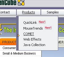
| When you hover or click your mouse over the horzontal bar, another vertical menu may appear with more choices. This is called a drop down menu. |
|
|
Some web sites like to use a tabbed menu style, a bit like a filing cabinet drawer. Each tab takes you to a different area within the site |
When there are many levels to a site, a good trick is to use a breadcrumb menu that shows how you got to where you are on the site. Just like the Hansel and Gretel fairytale! It is normally situated just beneath the banner. |
|
As a designer, it is up to you to decide on the style of menus you wish to use. On the more complicated sites, you will find more than one style in use.
Challenge see if you can find out one extra fact on this topic that we haven't already told you
Click on this link: Page Menus


