 KEY STAGE THREE
  Information Home
 Task Information
Important information about your presentation
Your presentation should have a beginning, middle and end
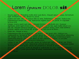
You should use a consistent background and font styles throughout.
Keep animation and sounds to an absolute minimum – if used at all
Avoid automatic slide timings as these can make it difficult when you are presenting to an audience
Font on slides should be approximately 22 points.
You should have no more than 5 bullet points on a slide. Do not use paragraphs of text.
Images should be suitable – consider your audience. If you are doing a topic like abortion, some images can be very disturbing, especially if people aren’t expecting to see them. Consider putting images such as these on a separate slide and then warning the audience before you show it so that they can turn away.
You should make use of the Master Slide facility to put standard information that will be repeated on every slide e.g. your names, a logo
You should set your font styles for the title and the body text through the Master Slide.
Think about creating an index page with hyperlinks which will allow the audience to navigate through your presentation in any order they wish. Also include return hyperlinks.
Include suitable hyperlinks to supporting documents, images, websites.
Copyright © www.teach-ict.com


