4. Colour for emphasis
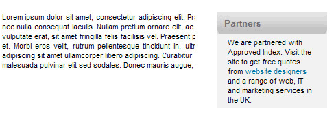
A good trick to highlight areas of interest on the interface is to use a coloured block. This helps separate that information from the main content. In magazines this is called a 'boxout' but it works equally well on screen.

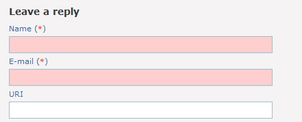
The method can also be used to highlight mandatory parts of a form you must fill in, whereas other parts are optional, as shown below

challenge see if you can find out one extra fact on this topic that we haven't already told you
Click on this link: Creating attractive forms
